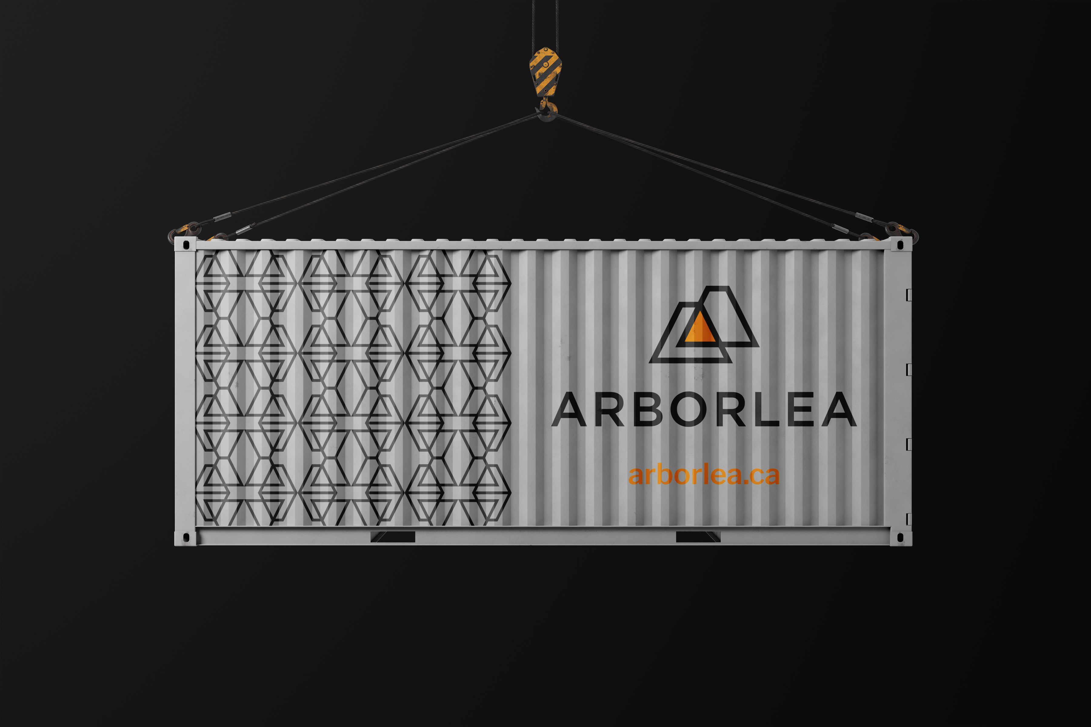
Client: Arborlea Developments
Role: Brand strategy, identity design, graphic design, brand guidelines
Completed through: Mitchell Digital
Year: 2022
Overview
Arborlea Developments is a family-owned commercial construction company specializing in general contracting and project management. The goal of the brand refresh was to create a more elevated and timeless identity that reflected the company’s experience, quality and values while supporting its growth into a broader range of commercial markets.
Working through Mitchell Digital, I helped define the brand’s positioning and visual direction before developing a complete identity system designed to feel professional, clear, trustworthy and approachable.
Brand Identity
Arborlea’s identity was designed to feel elevated, professional and trustworthy while remaining approachable. The system combines a geometric logo, warm orange and neutral tones, clean typography, and supporting patterns and iconography to create a flexible visual language for print and digital use.
Brand Guide Selections


Business Essentials


Built for the Real World


Design Process
The Arborlea refresh began with discovery and positioning before moving through concept development, refinement and client feedback. Each stage helped narrow the visual direction into a cohesive identity grounded in the company’s values, audience and goals.

Discovery & Strategy
Discovery focused on Arborlea’s audience, competitive landscape, values and desired brand perception, establishing a clear foundation for the visual direction.


Concept Development
Multiple visual directions were explored around ideas of building, connection, structure and the letterforms within the Arborlea name.


Refinement
Client feedback helped narrow the strongest directions, with further refinement to proportion, typography, colour and the relationship between the brandmark and wordmark.


